
Modern Italian Immigrants In Canada And Preferential Attachment
Where do modern Italian immigrants go to live in Canada? Is their choice affected by preferential attachment?
A Data Science project carried out with Jupyter and R | May 5, 2017

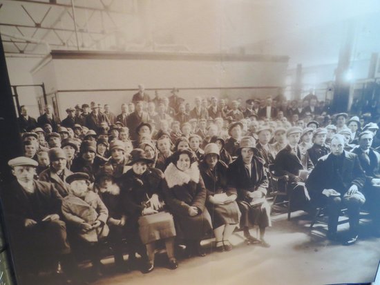
I am Italian, and I know how traditionalists we are. Wherever we go, we look for Italian food, Italian clothes, Italian cars, and… someone speaking Italian. We share this feature with all the other Mediterranean peoples. Our Country is well known for the food, its nice weather, its culture, history, and music. But many ignore the fact that Italy has historically been harsh towards its sons and daughters, repeatedly forcing them to migrate in search for a better life. The Italian Diaspora has had two main runs, first from 1860-1920, and then from 1945-1970. In 1913 alone, a mind-boggling 872,598 people fled. Many of them liked Canada and the promise of a better life it offered. I have always been fascinated with stories of people leaving the sad double f behind (family and famine), selling whatever they had to buy the tickets, and sailing across the Atlantic Ocean. Parents, relatives, acquintances, or the unknown for the unlucky ones, lied ahead. For many, that was a one-way journey driven by the need for a better future. But first, they had to do a stopover in Halifax, at Pier 21.
Source
These days, not much seems to have changed. We are far more educated than our predecessors, possibly overeducated, but here we are again. Italy is currently fording its way through a muddy river of unemployment and economic crisis, partly due to catastrophic political choices and the evergreen corruption. This has caused upwards of 173,000 Italians to leave the Country from 2012-2013, 36.2% of which were aged 18-34. That is a conspicuous slice of its future that our Country is giving away, and the trend seems to be on the rise. Canada was, and still is, a favorite destination.
Italians used to settle in places where other Italians had settled, in an attempt to mitigate the shock. This, together with the many family-based sponsorships, made sure that the existing Italian communities grew larger. This phenomenon reminds me of the preferential attachment, which is studied in fields such as network theory [4]. According to it, new nodes are connected to pre-existing nodes in a network based on the number of connections that the latter already have. That’s like saying that, at a party, you are much more willing to shake hands with and introduce yourself to those who are interacting with the highest number of people in the room. Which means, you trust or are more attracted by the most socially active people, as opposed to the lonely souls.
A process like this, as Albert-László Barabási described it in his works, results in large components growing larger, eventually evolving into a scale-free system. When the size of the components are plotted against their frequency, a power law behavior emerges, where a few communities are very frequently preferred, the large majority being the road less traveled.
My idea is to test whether the modern Italian immigrants - those admitted into Canada by means of a Permanent Residency during the period 2006-2015 - targeted the Canadian cities with the highest percentage of Italian residents, or whether they used other factors to select their intended destination.
To identify the places where Italians have historically settled, let’s consider all Canadian cities with a population of Italian descent of at least 2,000 people. The total population data are available through [1], whereas the data regarding Italians come from [2]. Latitude and longitude values can be looked up in [3].
library(maps)
library(mapdata)
data<-read.csv("C:\\Users\\Francesco\\Desktop\\Data_Science_portfolio\\Italians_in_Canada.csv")
newdata<-data[order(-data$Percentage),]
newdata
| ID | City | Province | Italians | Population | Percentage | Lat | Lon | |
|---|---|---|---|---|---|---|---|---|
| 14 | 14 | Bolton | Ontario | 3030 | 25954 | 11.7 | 43.52 | -79.44 |
| 5 | 5 | St. Catharines | Ontario | 9915 | 133113 | 7.5 | 43.11 | -79.14 |
| 2 | 2 | Montreal | Quebec | 108435 | 1704694 | 6.3 | 45.30 | -73.34 |
| 1 | 1 | Toronto | Ontario | 153285 | 2731571 | 5.6 | 43.42 | -79.24 |
| 11 | 11 | Sault Ste. Marie | Ontario | 3295 | 73368 | 4.5 | 46.32 | -84.21 |
| 7 | 7 | Windsor | Ontario | 8515 | 217188 | 3.9 | 42.17 | -83.00 |
| 3 | 3 | Hamilton | Ontario | 18130 | 536917 | 3.4 | 43.15 | -79.52 |
| 15 | 15 | Thunder Bay | Ontario | 2940 | 108359 | 2.7 | 48.22 | -89.14 |
| 4 | 4 | Vancouver | British Columbia | 15430 | 631486 | 2.4 | 49.15 | -123.60 |
| 12 | 12 | Oshawa | Ontario | 3290 | 149607 | 2.2 | 43.54 | -78.51 |
| 17 | 17 | Guelph | Ontario | 2350 | 131794 | 1.8 | 43.33 | -80.15 |
| 16 | 16 | Sudbury | Ontario | 2480 | 161531 | 1.5 | 46.29 | -81.00 |
| 6 | 6 | Ottawa | Ontario | 8595 | 934243 | 0.9 | 45.25 | -75.41 |
| 13 | 13 | London | Ontario | 3140 | 383822 | 0.8 | 42.98 | -81.25 |
| 9 | 9 | Edmonton | Alberta | 4920 | 932546 | 0.5 | 53.32 | -113.30 |
| 10 | 10 | Winnipeg | Manitoba | 3800 | 705244 | 0.5 | 49.53 | -97.08 |
| 8 | 8 | Calgary | Alberta | 5210 | 1239220 | 0.4 | 51.03 | -114.04 |
Table 1
When plotted with circles, it is really evident where Italians traditionally live in Canada.
options(repr.plot.width=7, repr.plot.height=5)
map("worldHires","Canada", xlim=c(-141,-53), ylim=c(40,85), col="gray90", fill=TRUE)
points(data$Lon, data$Lat, pch=19, col=rgb(255/255,0/255,0/255,alpha=0.5), cex=data$Percentage/2)
par(xpd=TRUE) #Places legend outside the plot
legend(x=-60,y=85,title="Italians (%)",pt.cex=newdata$Percentage/2,bty="n",pch=19,legend=newdata$Percentage,text.col="black",
       col=rgb(255/255,0/255,0/255,alpha=0.5),pt.bg=rgb(255/255,0/255,0/255,alpha=0.5))
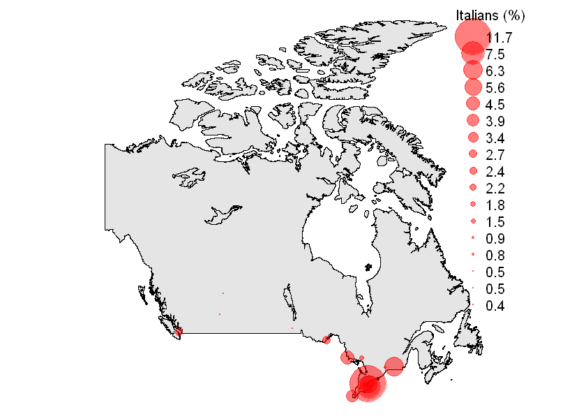 Figure 1
The Ontario-Quebec macroregion is the most densely populated in Canada, combining for 21.82 million people as of 2014. This macroregion is home to the largest Italian groups, located primarily along the Windsor-Montreal corridor. Below is a snapshot centered on the Ontario-Quebec area:
Ontario and Quebec
ont <- newdata[newdata$Province == "Ontario" | newdata$Province == "Quebec", ] #|=or
ont
| ID | City | Province | Italians | Population | Percentage | Lat | Lon | |
|---|---|---|---|---|---|---|---|---|
| 14 | 14 | Bolton | Ontario | 3030 | 25954 | 11.7 | 43.52 | -79.44 |
| 5 | 5 | St. Catharines | Ontario | 9915 | 133113 | 7.5 | 43.11 | -79.14 |
| 2 | 2 | Montreal | Quebec | 108435 | 1704694 | 6.3 | 45.30 | -73.34 |
| 1 | 1 | Toronto | Ontario | 153285 | 2731571 | 5.6 | 43.42 | -79.24 |
| 11 | 11 | Sault Ste. Marie | Ontario | 3295 | 73368 | 4.5 | 46.32 | -84.21 |
| 7 | 7 | Windsor | Ontario | 8515 | 217188 | 3.9 | 42.17 | -83.00 |
| 3 | 3 | Hamilton | Ontario | 18130 | 536917 | 3.4 | 43.15 | -79.52 |
| 15 | 15 | Thunder Bay | Ontario | 2940 | 108359 | 2.7 | 48.22 | -89.14 |
| 12 | 12 | Oshawa | Ontario | 3290 | 149607 | 2.2 | 43.54 | -78.51 |
| 17 | 17 | Guelph | Ontario | 2350 | 131794 | 1.8 | 43.33 | -80.15 |
| 16 | 16 | Sudbury | Ontario | 2480 | 161531 | 1.5 | 46.29 | -81.00 |
| 6 | 6 | Ottawa | Ontario | 8595 | 934243 | 0.9 | 45.25 | -75.41 |
| 13 | 13 | London | Ontario | 3140 | 383822 | 0.8 | 42.98 | -81.25 |
Table 2
options(repr.plot.width=7, repr.plot.height=5)
map("worldHires","Canada", xlim=c(-91.5,-65), ylim=c(40,57), col="gray90", fill=TRUE)
points(data$Lon, data$Lat, pch=19, col=rgb(255/255,0/255,0/255,alpha=0.4), cex=data$Percentage/2)
text(x=-89.14, y=48.22-0.8, labels="Thunder Bay", cex= 0.8,font=2)
text(x=-73.34+1, y=45.30-0.8, labels="Montreal", cex= 0.8,font=2)
text(x=-75.41-1, y=45.25+0.5, labels="Ottawa", cex= 0.8,font=2)
text(x=-83-2, y=42.17, labels="Windsor", cex= 0.8,font=2)
text(x=-84.21-1, y=46.32-0.8, labels="Sault Ste. Marie", cex= 0.8,font=2)
text(x=-81.00, y=46.29+0.5, labels="Sudbury", cex= 0.8,font=2)
text(x=-79.44+0.7, y=43.52+1, labels="Bolton", cex= 0.8,font=2)
text(x=-81.25-1.8, y=42.98+0.2, labels="London", cex= 0.8,font=2)
text(x=-80.15-1.8, y=43.33+0.2, labels="Guelph", cex= 0.8,font=2)
text(x=-79.44+3, y=43.11+0.5, labels="Toronto", cex= 0.8,font=2)
text(x=-79.44+3, y=43.11+0.1, labels="Hamilton", cex= 0.8,font=2)
text(x=-79.44+3, y=42.81, labels="St. Catharines", cex= 0.8,font=2)
text(x=-79.44+3, y=42.41, labels="Oshawa", cex= 0.8,font=2)
text(x=-81.00, y=46.29+3, labels="ONTARIO", cex= 0.8,font=3)
text(x=-73.34+1, y=45.30+5, labels="QUEBEC", cex= 0.8,font=3)
par(xpd=TRUE) #Places legend outside the plot
legend(x=-65,y=56,title="Italians (%)",pt.cex=c(1,2,2.5,3.5,6),bty="n",pch=19,legend=c("<1","2","5","8",">10"),
       text.col="black",col=rgb(255/255,0/255,0/255,alpha=0.4),pt.bg=rgb(255/255,0/255,0/255,alpha=0.4))
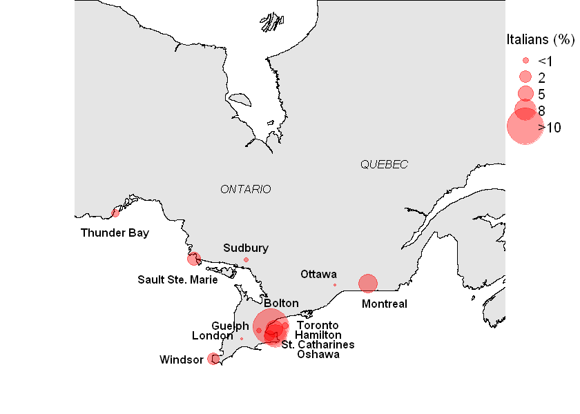 Figure 2
As visible, the Italian population in this area is mainly living in the Toronto-Hamilton-St. Catharines-Oshawa-Bolton conurbation, which in 2014 had 3,577,162 residents. Of these, the Italians were a slice as large as 5.25%. Away from this hotbed, notable Italian presence can be observed in Montreal (6.3%), Sault Ste. Marie (4.5%), and Windsor (3.9%).
#Plotting
cols <- ifelse(ont$City == "Toronto" | ont$City == "Hamilton" | ont$City == "Oshawa" |
	       ont$City == "St. Catharines" | ont$City == "Bolton", "darkred","grey")
mybar<-barplot(ont$Percentage,names.arg=ont$City,main="Percentage of Italian Residents by City",ylab="%",
	ylim=c(0,12),cex.names=0.70,las=2,col=cols,)
lines(x = mybar, y = ont$Percentage,col="blue",lwd=3,lty="dashed")
legend(12, 11, legend=c("Macroregion","Other","Power law"),fill=c("darkred", "grey","blue"),cex=0.88)
mtext("Ontario and Quebec")
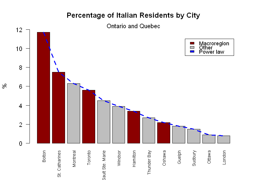 Figure 3
Now, it is clear that there has always been a trend for Italians to go to Ontario (or Quebec, to a lesser extent). Only a few endeavoured to settle on the West Coast (Italians constitute 2.4% of Vancouver’s population), and even less reached the Prairies (the Italians in Calgary, Edmonton, and Winnipeg do not exceed 0.5% of the total number of residents in each city, with Regina and Saskatoon not even making the cut).
Given this situation, I thought two questions were legitimate:
- Where do modern Italian immigrants go to live, in Canada?
- Are they biased by the presence of other Italians upon selecting their destination?
These questions are obviously referred to Permanent Residents (PRs) only, thus excluding temporary residents, students, and tourists. At any rate, this is also a good opportunity to detect the presence of the previously described preferential attachment.
The Italian PRs newly admitted into Canada might decide that they want to settle in places with an Italian presence, hoping that this would facilitate the integration process. So, question number 2 becomes:
Are modern Italian immigrants (unknowingly) affected by preferential attachment?
This question is all the more legitimate given the presence of that dashed blue line in Figure 3, which might suggest the presence of a power law behavior in the historical trend of Italian immigration to Canada. This, as Albert-László Barabási said, is the signature of preferential attachment.
To find the answer I am relying on the Permanent Residents Datasets made available by the Government of Canada. Particularly useful is the Admissions of Permanent Residents by Province/Territory and Census Metropolitan Area (CMA) of Intended Destination and Country of Citizenship file. This open dataset reports the number of total PRs admitted into Canada from 2006-2016, divided by Country of origin and intended destination. I want to answer questions number 1 and 2 by computing the percentage of Italian PRs in the period 2006-2015 in each city in Table 2, and compare these values with those in Figure 3.
Unfortunately, the most remarkable part of the bar plot in Figure 3 - represented by the city of Bolton, Ontario - is not plottable, as in the dataset it is part of the Toronto Census Metropolitan Area, and as such its PRs data are not available. This will make things somewhat different from Figure 3.
Table 3 shows the number of PRs issued to Italian immigrants in the period 2006-2015:
itprs<-read.csv("C:\\Users\\Francesco\\Desktop\\Data_Science_portfolio\\Italian_PR_admissions.csv",header=TRUE,check.names=FALSE)
itprs<-itprs[order(itprs$City),]
itprs
| City | Province | 2006 | 2007 | 2008 | 2009 | 2010 | 2011 | 2012 | 2013 | 2014 | 2015 | Total | |
|---|---|---|---|---|---|---|---|---|---|---|---|---|---|
| 1 | Bolton | Ontario | NA | NA | NA | NA | NA | NA | NA | NA | NA | NA | NA |
| 10 | Guelph | Ontario | 0 | 0 | 0 | 0 | 0 | 0 | 0 | 0 | 0 | 0 | 0 |
| 7 | Hamilton | Ontario | 5 | 5 | 5 | 15 | 5 | 10 | 0 | 5 | 0 | 15 | 55 |
| 13 | London | Ontario | 0 | 0 | 5 | 5 | 5 | 0 | 0 | 0 | 0 | 0 | 15 |
| 3 | Montreal | Quebec | 65 | 75 | 80 | 75 | 75 | 60 | 75 | 110 | 110 | 125 | 850 |
| 9 | Oshawa | Ontario | 0 | 0 | 0 | 0 | 0 | 0 | 0 | 0 | 5 | 5 | 10 |
| 12 | Ottawa | Ontario | 5 | 15 | 10 | 25 | 15 | 20 | 10 | 15 | 25 | 20 | 160 |
| 5 | Sault Ste. Marie | Ontario | 0 | 0 | 0 | 0 | 0 | 0 | 0 | 0 | 0 | 0 | 0 |
| 2 | St. Catharines | Ontario | 0 | 5 | 5 | 0 | 0 | 0 | 0 | 0 | 5 | 0 | 15 |
| 11 | Sudbury | Ontario | 0 | 0 | 0 | 0 | 0 | 0 | 5 | 0 | 0 | 0 | 5 |
| 8 | Thunder Bay | Ontario | 0 | 0 | 5 | 0 | 0 | 0 | 0 | 0 | 0 | 0 | 5 |
| 4 | Toronto | Ontario | 130 | 100 | 110 | 150 | 150 | 125 | 130 | 165 | 170 | 215 | 1445 |
| 6 | Windsor | Ontario | 0 | 5 | 0 | 0 | 0 | 0 | 0 | 5 | 5 | 5 | 20 |
Table 3
The total number of new PRs in the cities in Table 2 over the 2006-2015 period is derived from the same dataset as above:
prs<-read.csv("C:\\Users\\Francesco\\Desktop\\Data_Science_portfolio\\Total_PR_admissions.csv",header=TRUE,check.names=FALSE)
prs<-prs[order(prs$City),]
prs
| City | Province | 2006 | 2007 | 2008 | 2009 | 2010 | 2011 | 2012 | 2013 | 2014 | 2015 | Total | |
|---|---|---|---|---|---|---|---|---|---|---|---|---|---|
| 1 | Bolton | Ontario | NA | NA | NA | NA | NA | NA | NA | NA | NA | NA | NA |
| 10 | Guelph | Ontario | 775 | 710 | 760 | 635 | 615 | 525 | 610 | 620 | 610 | 685 | 6545 |
| 7 | Hamilton | Ontario | 3990 | 3645 | 3760 | 3705 | 3980 | 3255 | 4065 | 3225 | 3105 | 3020 | 35750 |
| 13 | London | Ontario | 2980 | 2470 | 2335 | 2480 | 2940 | 2275 | 1865 | 2060 | 2000 | 1985 | 23390 |
| 3 | Montreal | Quebec | 35550 | 35755 | 36040 | 39155 | 42295 | 40290 | 42735 | 40575 | 39995 | 39365 | 391755 |
| 9 | Oshawa | Ontario | 745 | 865 | 735 | 800 | 760 | 770 | 720 | 835 | 795 | 640 | 7665 |
| 12 | Ottawa | Ontario | 6310 | 5830 | 6315 | 6830 | 7210 | 6450 | 6110 | 6040 | 5255 | 6245 | 62595 |
| 5 | Sault Ste. Marie | Ontario | 60 | 65 | 70 | 60 | 95 | 50 | 55 | 50 | 55 | 70 | 630 |
| 2 | St. Catharines | Ontario | 1590 | 1380 | 1235 | 1115 | 1255 | 1155 | 965 | 980 | 915 | 920 | 11510 |
| 11 | Sudbury | Ontario | 130 | 135 | 135 | 145 | 115 | 145 | 150 | 170 | 290 | 185 | 1600 |
| 8 | Thunder Bay | Ontario | 180 | 145 | 140 | 120 | 150 | 115 | 95 | 105 | 130 | 150 | 1330 |
| 4 | Toronto | Ontario | 99015 | 86890 | 86665 | 82400 | 91855 | 77535 | 77030 | 81465 | 75650 | 82110 | 840615 |
| 6 | Windsor | Ontario | 2840 | 2265 | 2015 | 1970 | 1875 | 1710 | 1240 | 1690 | 1455 | 1810 | 18870 |
Table 4
The percentage of Italian PRs with respect to the totals in Table 4 is easy to compute:
itprs$PRs_Percentage<-round(itprs$Total/prs$Total,digits=3)*100
df<-data.frame("City"=ont$City,"Historical_Percentage"=ont$Percentage,
	       "Current_Percentage"=itprs$PRs_Percentage,check.names=FALSE)
df<-df[order(-df$Historical_Percentage),]
df
| City | Historical_Percentage | Current_Percentage |
|---|---|---|
| Bolton | 11.7 | NA |
| St. Catharines | 7.5 | 0.0 |
| Montreal | 6.3 | 0.2 |
| Toronto | 5.6 | 0.1 |
| Sault Ste. Marie | 4.5 | 0.2 |
| Windsor | 3.9 | 0.1 |
| Hamilton | 3.4 | 0.3 |
| Thunder Bay | 2.7 | 0.0 |
| Oshawa | 2.2 | 0.1 |
| Guelph | 1.8 | 0.3 |
| Sudbury | 1.5 | 0.4 |
| Ottawa | 0.9 | 0.2 |
| London | 0.8 | 0.1 |
Table 5
Now, back to question 2: do modern Italians settle in places in Canada where the Italian presence is historically notable?
names <- c("Bolton", "St. Catharines", "Montreal", "Toronto", "Sault Ste. Marie",
	   "Windsor","Hamilton","Thunder Bay","Oshawa","Guelph","Sudbury","Ottawa","London")
barplot(cbind(df$Historical_Percentage,df$Current_Percentage), main="Historical vs Current Percentage of Italian Immigrants",
	ylab="%", beside=TRUE, col=rep(c('darkblue', 'red'), each=13),ylim=c(0,12),names.arg=c(names,names),las=2,cex.names=0.7)
legend(13, 11.5, c("Historical","Current"), cex=0.88, fill=c("darkblue","red"))
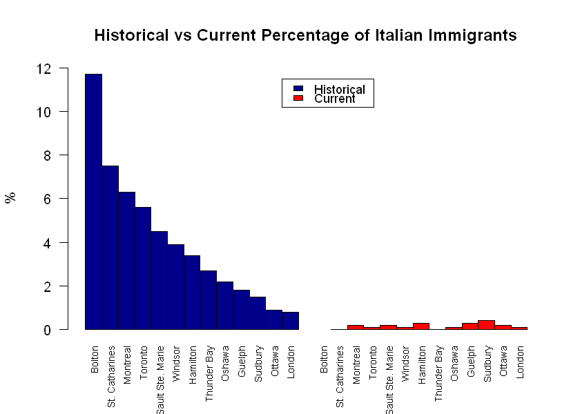 Figure 4
By looking at Figure 4, we can conclude that: no, new Italians seem to be unaffected by preferential attachment.
This means that they ignore the places where Italians have traditionally moved to, and instead use other criteria to select their destination. So, this is one big suriprise for me!
The (tiny) numbers of new Italian immigrants no longer choose Bolton or St. Catharines as their top two favorite destinations. Bolton is included in the Toronto figure, so it is possible to conclude that its appeal has almost disappeared over the decades. New Italians, instead, head mostly to Sudbury, Hamilton, Guelph. Even Montreal and Toronto are the road less traveled these days, and this can be due to a number of factors, most likely house affordability and living costs.
To check whether the new Italians use more affordable housing as a relocation criterion, it is probably worth checking the average Shelter-To-Income-Ratio (STIR), which is the percentage of total before-tax household income spent on shelter. So, a higher STIR means a more expensive houshold. The following data ara available through the beyond 2020 website, via the “Lauch Table Viewer” option. The unemployment rate values come from statcan.
stir<-read.csv("C:\\Users\\Francesco\\Desktop\\Data_Science_portfolio\\Average_STIR_Canada.csv",header=TRUE,check.names=FALSE)
stir<-stir[order(stir$City),]
stir
| City | Average_STIR_2011_CMA | Unemployment_March2017 | |
|---|---|---|---|
| 1 | Bolton | NA | NA |
| 10 | Guelph | 22.2 | 5.4 |
| 7 | Hamilton | 22.5 | 5.9 |
| 13 | London | 22.6 | 6.0 |
| 3 | Montreal | 23.2 | 6.6 |
| 9 | Oshawa | 22.5 | 6.0 |
| 12 | Ottawa | 21.0 | 5.1 |
| 5 | Sault Ste. Marie | 19.7 | 8.1 |
| 2 | St. Catharines | 22.4 | 6.4 |
| 11 | Sudbury | 21.0 | 7.4 |
| 8 | Thunder Bay | 19.3 | 5.8 |
| 4 | Toronto | 24.7 | 7.1 |
| 6 | Windsor | 21.3 | 8.8 |
Table 6
Comparing Table 6 with Figure 4 reveals that Toronto and Montreal probably are not good choices due to the high STIR percentage, which includes all types of households. Toronto also has the worse unemployment rate of the two. On the other hand, Thunder Bay is likely receiving less attention due to its distance from the Golden Horseshoe area. Moving to Sudbury and Greater Sudbury is a risk - given the third highest unemployment rate - that new Italians seem to be willing to take. All in all, the Ottawa-Gatineau CMA seems to be offering the better conditions.
But which aspect drives the relocation choice of new Italians the most? Do they move more to cities with low STIRs, or to places with low unemployment rates? Let’s take a look at two regression graphs: new Italian PRs vs STIR, and new Italian PRs vs Unemployment.
x1=stir$Average_STIR_2011_CMA
x2=stir$Unemployment_March2017
y=itprs$Total
par(mfrow=c(1,2))
plot(x1, y, xlab="Average STIR (%)",ylab="new Italian PRs",main="Average STIR vs Italian PRs",col="red",pch=16,cex.main=0.9)
grid()
plot(x2, y, xlab="Unemployment Rate (%)",ylab="new Italian PRs",main="Unemployment Rate vs Italian PRs",
     col="blue",pch=17,cex.main=0.9)
grid()
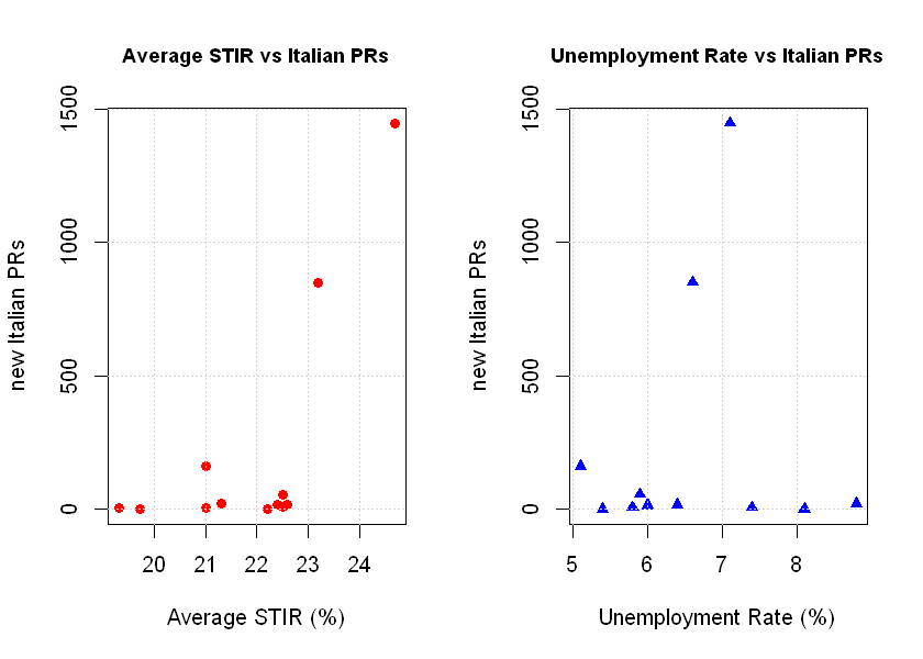 Figure 5
Figure 5 reveals that new Italians don’t supposedly look at things like STIR and unemployment rate upon selecting their destination in Canada, and that’s because the PRs issued to new Italians are not negatively correlated with STIR or the unemployment rate. Toronto and Montreal are, expectedly, the most common choices given the opportunities they offer in terms of job market. It is also the case that in these two cities the STIR is higher than the unemployment rate. This could be good news, apparently, but one has to consider how many of the available jobs effectively allow people to save money and live a life of fulfillment. Italians in Canada have certainly stopped following the nationality-based preferential attachment, and have embraced the move to the largest cities. In a way, however, they are still following the preferential attachment pattern, only that nowadays they are attracted by better employment opportunities rather than the reassuring presence of compatriots.
Sources
- Population data: https://en.wikipedia.org
- Italian residents in Canada (in Italian)
- Latitude and Longitude: https://en.wikipedia.org
- Barabási, A.-L., R. Albert (1999). Emergence of scaling in random networks. Science, 286 (5439): pages 509–512